Marketing video made for the previous version of Tink.
Tink Money
Golden Mobile Award 2013, Ranked #1 in App Store all categories for 3 straight weeks at launch, featured by Apple among Best New Apps, scored 5/5 by MacWorld.
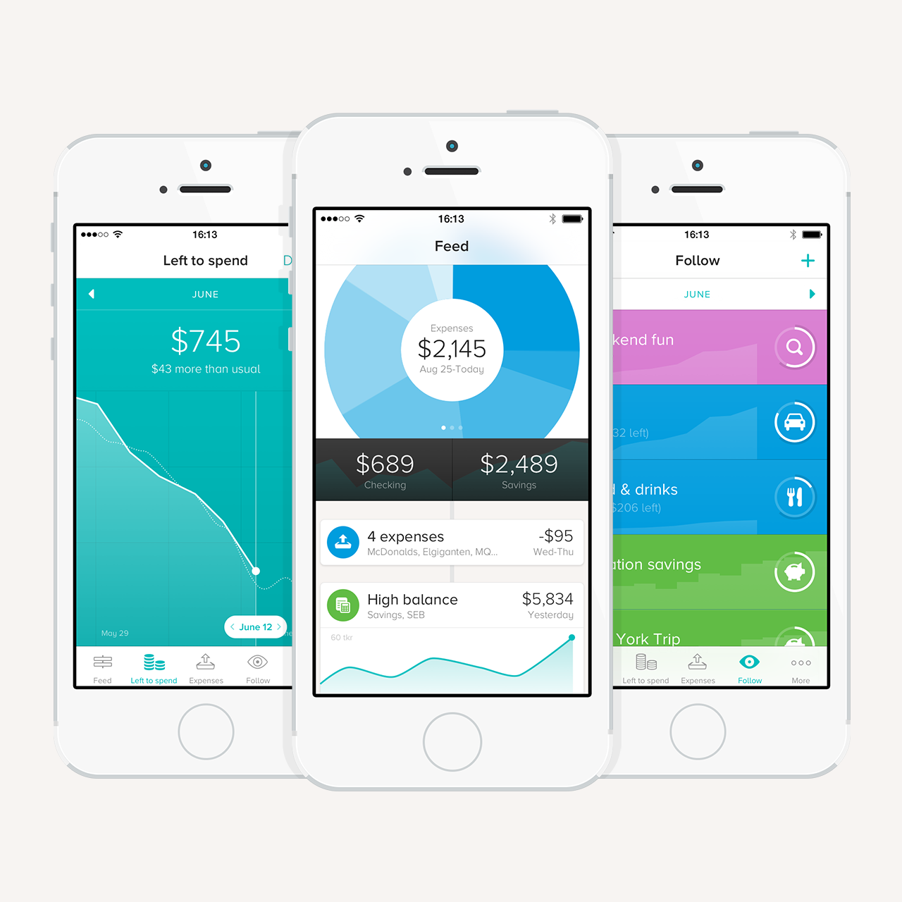
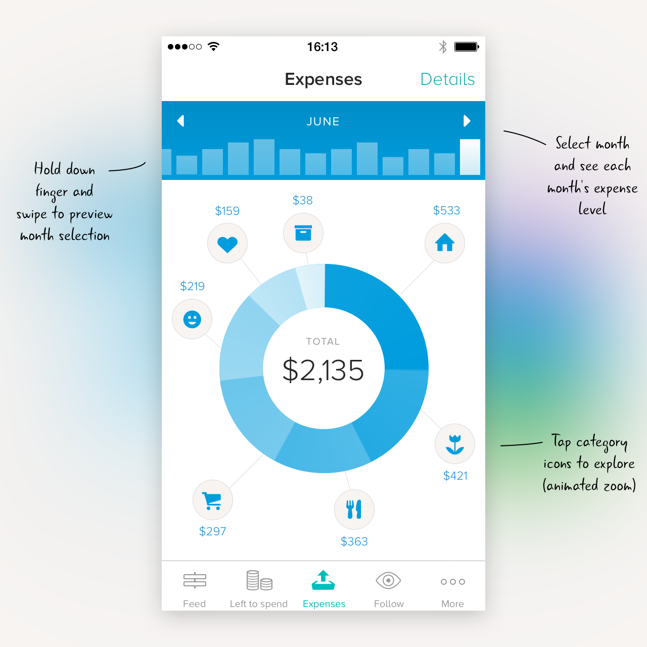
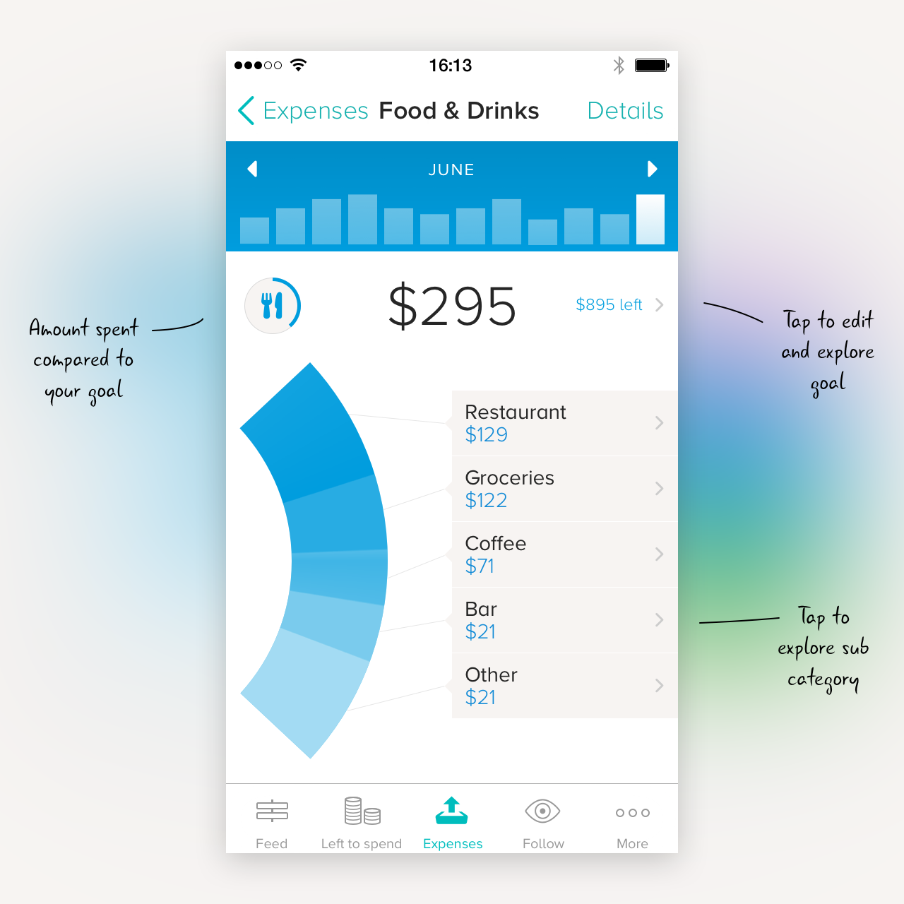
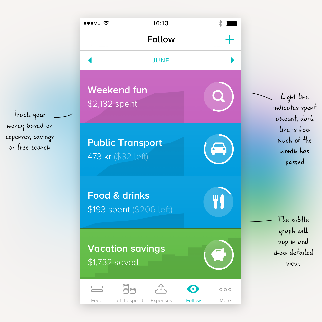
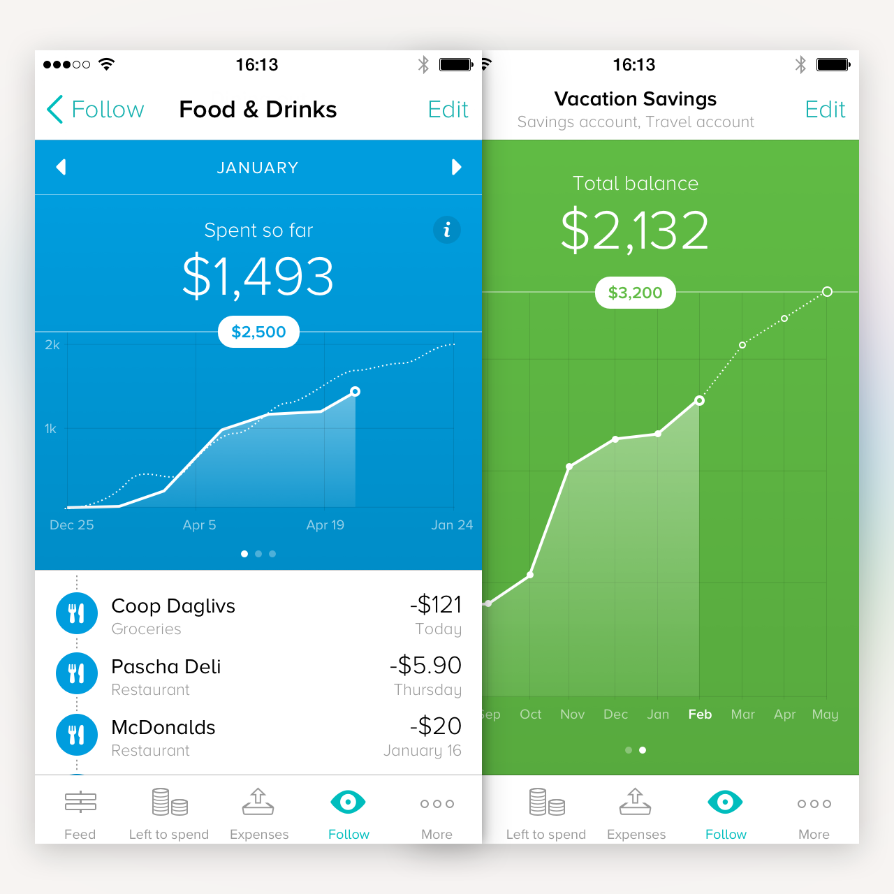
With Tink you can follow your income and see how much money you have spent – and on what. Tink is for everyone who has ever had cause to wonder where their money has gone and who wants to gain a better overview of their finances. Tink retrieves, categorises and analyses your purchases and presents your finances in a completely new way.
Design philosophy
The Lead Designer role in a small startup actually means being in charge of the whole experience, from concept and interaction flows to final graphic design. When coming up with new ideas or design solutions, I made up a list of important principals for the experience of Tink, I call it the Tink Commandments:
- Do it for you, rather than let you do it.
- Get it right, rather than get it all.
- Useful every day, rather than essential now and then.
- Enjoyable, rather than serious.
- Simple, rather than powerful.
- Respect integrity, rather than getting personal.
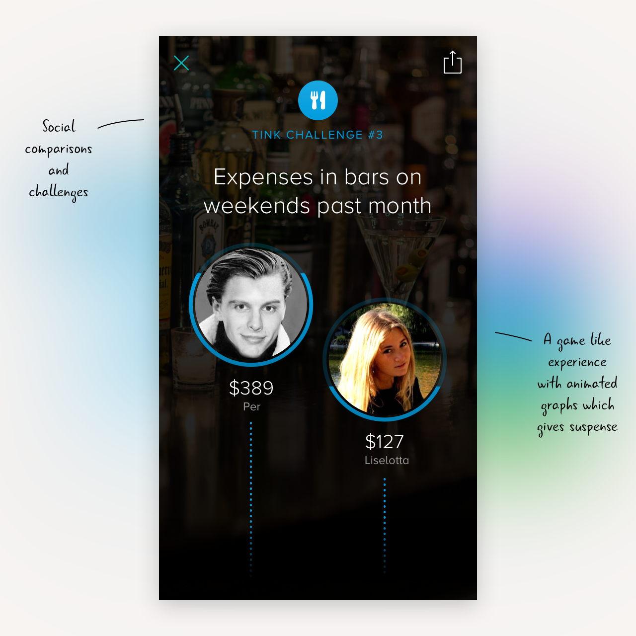
All those principals are meant to direct our think of our product and its future. We want it to be a tool that does certain thing great, and automatically. If we can't do it smart, then we don't do it at all. And being a personal finance app, it's important to try to be fun and enjoyable, rather than focusing on what's usually the financial comparisons.
Identity
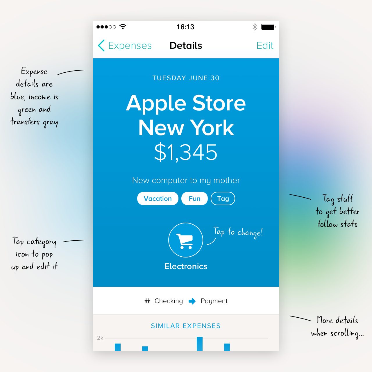
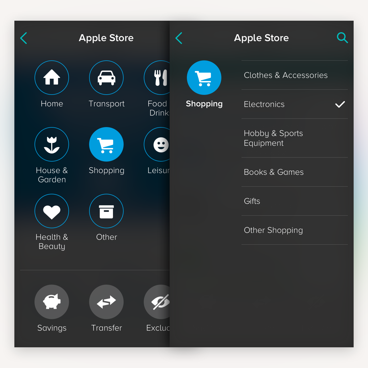
I created the whole visual identity from scratch also, to best fit a product like this, designed for mobile. I want every design detail to have a distinct meaning, even if small. The colors are easily distinguishable from one another, so that the blue expenses and green income are easy to tell apart when scrolling a feed. The icons are usually displayed small on screen, why I made them filled as much as possible and kept the details simple. Instead of giving each expense category different colors, I use the color differences to separate types of content and message throughout the app.
Interaction
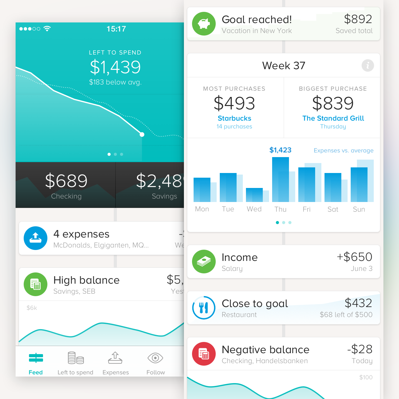
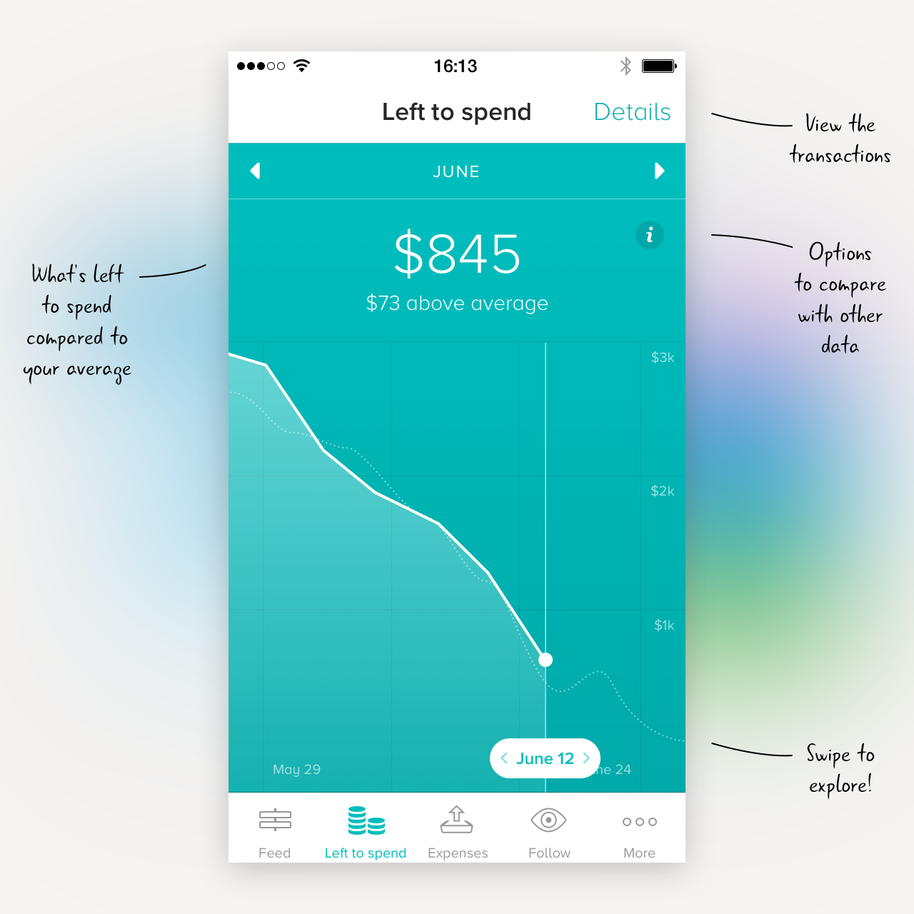
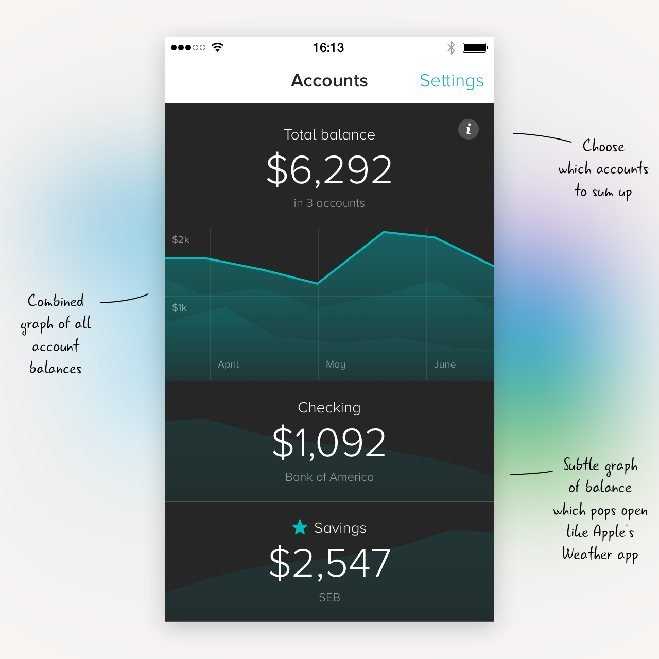
I want the experience of Tink to be quick and fluid, no matter if you just want to check your balance, or if you want help saving money for something. The first view of the app tries to answer what most people want to know when launching Tink. The top part is your current "left to spend" level, below that you get balances for your favorite accounts, and then you get the chronological feed of everything that happens in your financial life. We show you your transactions as well as deliver insights about stuff you never would have expected. The tab bar is effective if you quickly want to switch to a certain view when launching the app.
Graphics
Each view is distinctly different by carrying the various colors that describes that function.
- Blue expenses
- Green income
- Turquoise for combined income/expenses
- Pink for searches and insights
- Orange for alerts
- Red for errors and critical alerts
- Black for account balances
This helps the user to know where in the app they are and what they're looking at. Which is really important in this kind of statistic driven app with very few images available to me as a designer. I only want to use images if they really serve a purpose of explaining something.


